

Google stated, “Starting April 21, we will be expanding our use of mobile-friendliness as a ranking signal. This change will affect mobile searches in all languages worldwide and will have a significant impact in our search results.”

First, let’s discuss what mobile-friendly means. Although Google makes that call when it comes to search ranking on mobile devices, ultimately that decision comes down to your website users. Mobile-friendly websites take into account how your users interact with content and are built in a way to optimize and facilitate conversions. There are several design and technical elements that go into this approach, from the size of your text to how your site is coded on the backend to tell search engines how to display your content. What used to be a best practice, Google is now making a requirement.
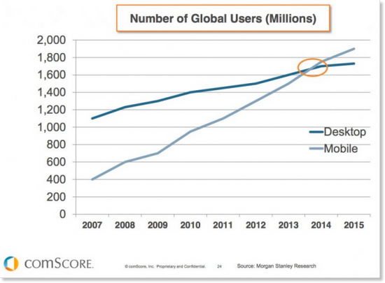
According to eMarketer, mobile usage is projected to surpass desktop browsing this year. When visitors arrive on your website with their mobile device, how is their overall experience? We are officially past the mobile Tipping Point. This report from comScore shows that mobile usage (mobile apps, combined with mobile web) as a whole accounts for 60% of time spent, while desktop-based digital media consumption makes up the remaining 40%.
What Does this Mean for Businesses?
If your site is deemed not mobile-friendly, you will see a significant drop in mobile traffic. Websites that are mobile-friendly will be favored in mobile search rankings, and those that aren’t, will be pushed down into oblivion.
Take a look at your analytics to see how much traffic your website currently gets through mobile organic search. Can you afford up to a 60% drop in website traffic? Our guess...probably not.
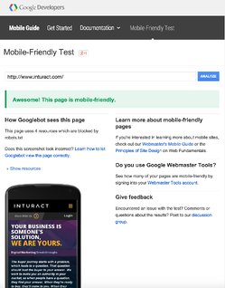
Does Your Site Pass the Google Test?
Those of you that have a mobile website or responsive design aren’t necessary safe either. Those tricky design and technical elements could be lurking under the surface. Fortunately Google has come out with the Mobile-Friendly testing tool that will let you know how your website is doing.
Take the Mobile-Friendly Test to see if your site has some work to do before April 21.
If you take the Mobile-Friendly Test and it yields good results, you have a significant advantage over your competition.
Mobilegeddon Survival Tips
For those with a glass half-full outlook on life, this shift in Google’s algorithm is an opportunity to pay attention to your mobile visitors. The trend in mobile usage isn’t going away, so now is the time to build a user-friendly mobile experience to optimize conversions for a large portion of your website traffic.
Here are some quick steps you can take to make sure your website isn’t impacted with the update:
- Analyze your analytics. What’s the bounce rate on mobile visitors? Are there certain pages where you frequently lose mobile traffic? Look for signals to show you that your site or certain pages on your site have room for improvement.
- Consider how mobile users use your website. There is often a difference in how mobile users browse on mobile vs. desktop. If Google is treating your desktop and mobile sites differently, so should you.
- Hire a designer/developer. If you don’t have the in-house resources to correct any mobile-unfriendliness issues by April 21, hire an agency for help. Keep in mind no matter who you hire, they need time to actually perform the fix, so if the Mobile-Friendly Test raises red flags, get on it now.
Did you pass the Google test?
If so, great, you should be good to go! If not, and you think Mobilegeddon could mean trouble for your website, don't worry we're here to help: