

Unfortunately, not every website is built to survive mobile devices. What does this mean? Although they look great on desktops computers, the truth is that almost 81% of smartphone users product search from a smartphone, and 50% of those people make decisions based on those searches. This means that if your website is not mobile-friendly, you might lose a sale or two... hundred- who knows! Moreover, you might just lose the battle against big and mighty Google.
As we’ve warned you earlier this year, Google is now making it a must: your website should be mobile optimized. (Click to Tweet!) What used to be a best practice then is now a requirement. The Mobilegeddon effect is here to stay.
Are you ready to survive it?
There are several design choices and technical elements that go into this much-needed makeover. From the size of the text to the backend of the site to SEO strategies; there is a lot to take in. We want you to succeed, so we made a list of elements you should consider changing if your site is not mobile-friendly. Check them out:
1. Responsive Design for Better Ranking
According to Ethan Marcotte's essay in A List Apart, responsive design is dependent on size and capabilities of a mobile device. On a phone, for instance, users would see content shown in a single column view. On a tablet, we might see the same content in two or three columns instead of one. On a desktop or laptop, there is no need to compartmentalize the site’s content.

The site should be designed in a way that the text, images, and video, if any, coexist and adapt together from device to device. (Click to Tweet!) There are a lot of businesses that "solve" this problem by making several websites. This is a mistake, especially in the eyes of Google. By implementing responsive design, you’ll have one website; this means that Google only has to crawl one version of it, making it easier for them to find and rank your site. By implementing responsive design, you'll also avoid disruptive experiences on your customer’s end. (Click to Tweet!) It’ll reduce load time and speed up the experience of the visitor. It just doesn’t get better than that.
2. Concise Content and Content Structures
Getting on the responsive wagon successfully is dependent on fruitful collaborative efforts. Content writers should be working alongside developers and designers to recreate a site that showcases both exceptional content strategy and excellent user experience. By stripping away unnecessary sentences or phrases, you’ll end up with content that delivers precise, focused words that make for a more ‘browsable’ site that enables conversion in a mobile device (and everywhere else).
3. Larger Fonts For Smaller Screens
Who likes to pinch-to-zoom? That’s right, nobody does. This, in fact, may be the reason 50% of those people who make decisions on mobile devices are leaving your site early. Visitors will not put up with it, and Google won’t either. Larger fonts allow visitors to have a much better experience, no matter which device they're using to browse your site.
See the difference?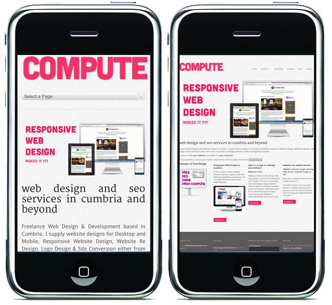

4. Come Up With Alt Text for Images That Won’t Render
Did you know that there are mobile apps out there that block images by default? Google and other search engines also sometimes have trouble "seeing" them, too. So, what can you do in this scenario?
To help keep your site looking great at all times, you can use Alt text (alternative text) on the images on your site that won’t render (to know which ones need work, you’ll have to test the mobile site on various browsers and devices).
Alt text is just a text field describing an image in a way people and computers can read, and it will only show when the image is unavailable.

For example, say that your business’ Twitter icon is not showing up, you might compose an Alt text that links to the Twitter profile.
Ready to implement Alt text on your site? All you have to do is add an attribute of the image tag; you can do this by clicking into your CMS' image editor. If you are a HubSpot partner, as we are, you’ll just need to click "Edit image" and enter a description into the "Alt Text (description)" field.
Do you want to know more about how you can make your website mobile-friendly? Get a free mobile assessment from our web experts. We'll be glad to go over the responsiveness of your website and give an overview of it's mobility. Click below to get started!