A CTA, or Call To Action, has one goal: Covert visitors to leads. With that one objective in mind, it’s easy to see the importance of how CTA’s are presented throughout your website. Fortunately for you, we've outlined some important steps to get those clicks ticking.
1. Color Correction
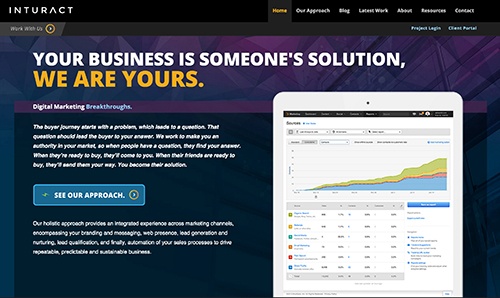
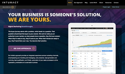
The first and foremost question usually asked is, “What color is optimal?” However, there is no one color to rule them all. What works for one website, may not work on another. The real trick is making the CTA stand out as part of the visual hierarchy on your page. (Click to Tweet!) Take these two variations as example:


Which CTA works better in this scenario? The purple one meshes with the surrounding visuals, but has no “pop” value. The blue CTA is more attention grabbing than the purple, still remaining cohesive with the design, thus creating a more effective button.
A good rule of thumb is to utilize the attention grabbing, or accent, color of your site’s color scheme as the color for your CTA. This color is used sparingly, and is usually a bit brighter, making it perfect for use on those buttons.
2. Push That Button
The next thing to account for is the overall shape and design of the button. The objective is to make the button look like it can, and should be clicked. Picture a big red cartoon button that’s too conspicuous not to push. That is the vision we want to instill in your users.
A CTA doesn’t necessarily have to be a lonely button. It could also be accompanied by, or within an image. That being said, keeping it simple will help distinguish the button without diluting the message it contains. There doesn’t need to be drop shadows, strokes, and gradients everywhere in order for a successful CTA to exist. (Click to Tweet!) Utilize them, but do it tastefully.
3. Placement
The placement of your call to action is also important to attract leads. It must seem natural to your visitors and must be relative to the content surrounding it. We personified a product in this post to show where the CTA plays its part in the buyer's journey. If your business has an online presence, the CTA should flow smoothly in your buyer's journey, similar to how it's fitted in this personified scenario. Also, it may use a free QR code like other CTAs; by scanning the QR code, they may receive rewards, discounts, etc. that may convert to leads.
4. Verbiage - Why Should I Care?
However the CTA is designed, a meaningful message should be jointly utilized to entice visitors into your sales funnel, or encourage the download tied to the CTA. In other words, use action verbs. As a very verbally reduced example “Download Now” will always be a more effective message than just “Download”.
If the CTA is for an informative download, use verbiage implying that by clicking the button, the user is about to learn something new. Using words like “discover, find, explore” will help convey this to the user.
Make the benefit clear, whether it’s an offer, service, product, trial, etc. (Click to Tweet!) Don’t be afraid to use the word “Free”, but don’t hide fine text bologna behind the word, or you may find yourself with one less potential customer.
Everybody likes opening fortune cookies, and your CTA can be the cookie people crack to receive that precious offer. (Click to Tweet!)
Check out how we use these tips to create one of our CTA's. One of our favorite things to do is to help small businesses optimize their inbound marketing. So, we created a CTA offering with just that, a complimentary business assessment. We took color, design, placement and verbiage into consideration to create the button below. Hopefully it catches your eye and if the offer is something you're interested in, you'll take action and the CTA will be a success!


