Some people believe in the power of color psychology as an instrument to further their business goals, where specific colors elicit certain emotions, causing various actions and/or reactions. Others think it’s malarkey, and only dependent on the color collaboration of elements as a whole, not on specific colors. Whether you believe in it or not, the power of color is undeniable, and the theory is so prevalent in marketing and society, that it must hold sway. When large groups of people believe in something, they give it power, regardless of fact or fiction.
One of the best examples actively in use is the color of restaurant logos, and specifically fast food. Nearly all the operating restaurants (McDonalds, Burger King, Wendy’s, KFC, Arby’s, Pizza Hut, Popeye’s, Jack in the Box, Chick-fil-a, Sonic and the list goes on) utilizes one or a combination of these colors: red, yellow, and blue. Red is the only color used across the board, with red and yellow being very popular. To find out why, we have to analyze the emotions associated when seeing the colors. Further, they also incorporate these colors into their restaurant menu templates.
Red is used to convey energy & excitement:
When seeing red we are encouraged into action and become energized. It is associated with our physical nature. With hunger being one of our base physical needs, it’s easy to see why this is a primary color used to advertise food and energy products. It is one of the popular colors for web design used in creating CTA’s (Calls to Action) when attempting to increase clicks. Be careful with overusing red, as it is also associated with aggression. (Click to Tweet!)
Yellow is used to give off a sense of happiness:
We perceive the sun as yellow, and therefore it can be associated with a source of life and rejuvenation. Yellow is best used in conjunction with another color, and even then, only as a supportive tone. (Click to Tweet!) When used with red it produces a feeling of hunger and increased respiration.
Blue communicates logic and trust:
This color instills a sense of serenity, and honesty. It speaks to our will to communicate. Blue puts us at ease and lets us rest assured we made the correct decision. (Click to Tweet!)
With these brief color analysis in mind, we gain some insight into why this color combination is so popular. When you see a fast food sign with these colors your brain is supposed to subliminally say, “Hey, eat here now because you’re hungry, require energy (red), and this will make you happy (yellow). Trust us, we know what you need (blue).”
So how does this all correlate to website design theory? And more specifically how can color psychology improve your marketing? Since most websites don’t serve fast food and are rather niche, it’s crucial to know your target audience. Knowing your audience and personas, will help you determine the color palette for your entire website. (Click to Tweet!)
It is important to note that color has different effects depending on the culture it’s intended to target. The world is slowly becoming a global community, but diversity still exists in color psychology. It’s wise to research you cultural target as part of the overall demographic.
For instance, if you want a clean, sleek, professional website which of these color palettes would be best to use throughout your site?

Example 1

Example 2
Color Palettes taken from color.adobe.com
You may know the answer without even knowing color psychology for web design. This just speaks to how ingrained color association has become when creating powerful branding. Option 1 is a superior choice if you are trying to convey a business with elegance, and power. Where Option 2 might be nice for a more playful company. Let’s break down why option 1 is better.
Black is used to show luxury and professionalism:
When used effectively black gives off a feeling of credibility, elegance, and even exclusivity. (Click to Tweet!) It is a professional, precise color, but should be accompanied by colors that lead it away from being overwhelming.
The blue-grey colors help offset the black, without being too jarring the eyes.
Orange creates a call to action:
Orange is a fun color because it can be utilized with many different color palettes to great effect. In general, though, and for the same purpose as our example, it best used as an action color. In this case, orange is meant to be jarring, aggressive, and literally call attention. (Click to Tweet!)
Overall our example website would say, “We have a company of credible professionals, with something exclusive for you (black). Look at our products here (orange)!"
Depending on your goals and target audience, color psychology does have the potential to improve your marketing conversions. However, you will need to utilize the proper colors in the correct fashion. Know where you want to go and colors can help you get there, but they won't carry you. (Click to Tweet!)
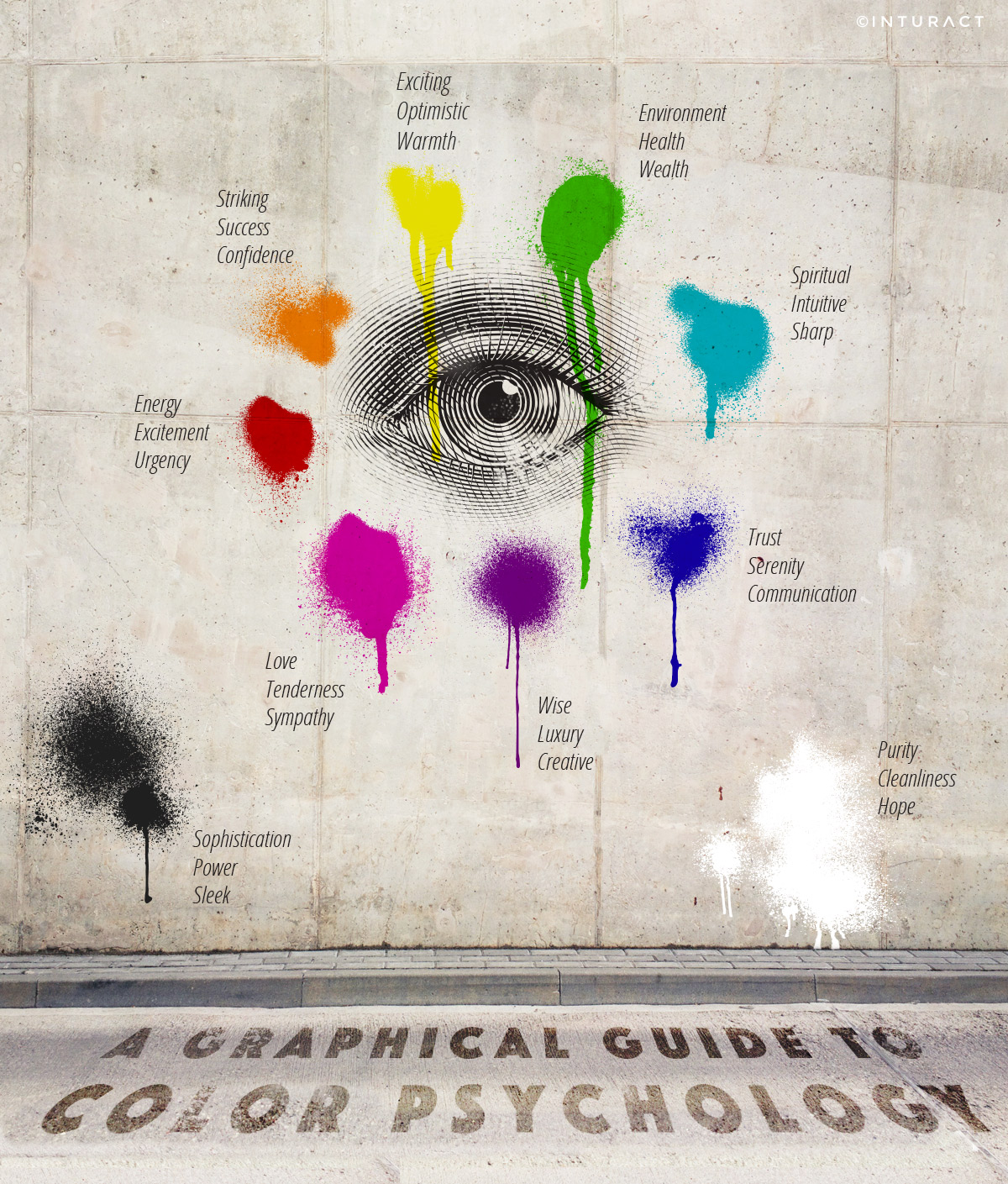
Now that you have a couple examples under you belt, and hopefully a little better understanding of how color psychology can affect your marketing efforts, here's a graphic to break down color psychology in marketing perspectives.

If you have only one takeaway from this post, let it be this quote by Faber Birren:
“We were asked the perfect color for a bar, and we suggested desert cactus, which would make you very thirsty.”- Faber Birren
The use of color in your marketing is just one of the numerous tactics you need to consider to execute inbound marketing. Ready to take the next step in inbound marketing?


